

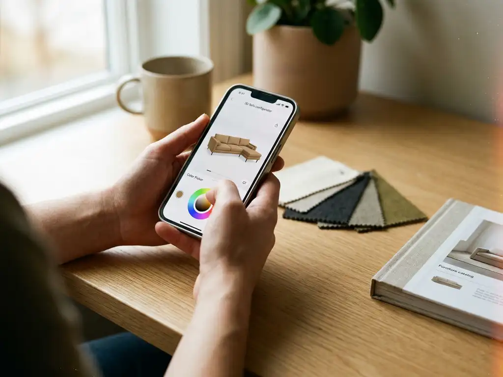
Keeping a product configurator accessible on mobile devices requires a combination of responsive design, touch-optimised interfaces, and lightweight rendering that adapts to smaller screens without sacrificing functionality. The core principle is simple: every configuration step, every visual, and every interaction must work just as well on a smartphone as it does on a desktop. This article walks through the most common challenges and practical answers to the questions furniture brands and retailers ask most often about mobile configurator accessibility.
What makes a product configurator difficult to use on mobile?
A product configurator becomes difficult to use on mobile when it is designed primarily for desktop interaction. The most common problems are oversized 3D renders that load slowly on mobile connections, touch targets that are too small for fingers, configuration panels that overflow the screen, and multi-step flows that lack clear progress indicators on narrow viewports.
These issues compound quickly for complex products. A sofa configurator with dozens of fabric options, multiple size variants, and real-time pricing logic can easily become unusable on mobile if the interface was never tested beyond a desktop browser. Specific friction points include:
- Horizontal scrolling within configuration panels that breaks the natural mobile flow
- Dropdown menus and hover states that do not translate to touch interactions
- 3D model viewers that require precise cursor control rather than pinch-and-rotate gestures
- Slow initial load times caused by uncompressed assets or unoptimised 3D geometry
- Checkout and summary screens that truncate product details on small displays
For furniture and home decoration products specifically, the challenge is amplified because the visual quality of the product matters enormously to the buying decision. A configurator that renders poorly or loads slowly on mobile does not just frustrate users — it actively undermines purchase confidence.
How does responsive design apply to a product configurator?
Responsive design in a product configurator means the layout, navigation, and visual components automatically adapt to the screen size and input method of the device being used. Rather than building separate mobile and desktop versions, a responsive configurator uses flexible grids, scalable assets, and conditional UI logic to serve the right experience on every device.
In practice, this involves more than simply reflowing text. For a configurator, responsive design must address three distinct layers:
- Layout: Configuration panels that stack vertically on mobile instead of sitting alongside the 3D viewer
- Interaction: Swipe gestures replacing click-and-drag, tap-friendly option selectors replacing small radio buttons
- Performance: Serving lower-resolution 3D assets or compressed textures to mobile devices to maintain acceptable load times
A well-implemented responsive configurator does not feel like a stripped-down version of the desktop experience. It feels purpose-built for the device the customer is using. This distinction matters because mobile shoppers are often browsing during consideration phases — comparing options, exploring variants, and forming purchase intent — even if they complete the transaction later on desktop.
What’s the difference between a mobile-optimised and a mobile-first configurator?
A mobile-optimised configurator starts as a desktop product that has been adapted to work on smaller screens. A mobile-first configurator is designed from the ground up with the mobile experience as the baseline, and then scaled up for larger screens. The difference is not just philosophical — it produces measurably different results in usability and performance.
Mobile-optimised tools often carry the structural weight of their desktop origins. Panels are compressed rather than redesigned. Features that do not translate well to touch are hidden rather than rethought. Performance is improved through compression, but the underlying architecture was not built with mobile constraints in mind.
A mobile-first approach starts by asking: what does a customer on a smartphone actually need to configure this product confidently? That question produces leaner flows, clearer visual hierarchy, and interaction patterns native to touch. When the same configurator is then extended to desktop, it gains additional features and screen real estate rather than losing them.
For furniture and home decoration brands targeting consumers who increasingly begin their product research on mobile, a mobile-first architecture is the more future-proof investment. It also tends to perform better on Google’s Core Web Vitals, which directly influence search ranking.
How can 3D and AR features work smoothly on mobile devices?
3D and AR features work smoothly on mobile when they are built using web-native standards, optimised asset pipelines, and progressive loading strategies. The key is delivering a high-quality visual experience without requiring a download or overwhelming the device’s processing capacity.
For 3D visualisation, smooth mobile performance depends on:
- Using compressed 3D formats such as glTF or USDZ that are natively supported by mobile browsers
- Implementing level-of-detail (LOD) rendering so the model complexity scales with device capability
- Loading textures progressively rather than waiting for the full asset bundle before displaying anything
- Optimising polygon counts for furniture models without sacrificing the visual realism that drives purchase confidence
For AR features, the most accessible approach in 2026 is WebAR — augmented reality that runs directly in the mobile browser without requiring an app download. WebAR uses the device camera and native AR frameworks to place a 3D product model in the user’s physical space. This removes the single biggest barrier to AR adoption: the friction of downloading a dedicated application.
Touch interaction within 3D viewers also needs careful attention. Pinch-to-zoom, single-finger rotation, and tap-to-select must behave predictably and respond quickly. Sluggish or imprecise gesture handling breaks immersion and reduces the confidence that 3D and AR are supposed to create.
Which mobile UX patterns work best for product configuration steps?
The most effective mobile UX patterns for product configuration use a single-column, step-by-step flow with persistent visual feedback, large touch targets, and a summary that is always accessible. These patterns reduce cognitive load and keep the customer focused on one decision at a time rather than presenting all options simultaneously.
Proven patterns for mobile configurator UX include:
- Bottom sheet panels: Configuration options slide up from the bottom of the screen, keeping the product visual prominent above while options remain accessible below
- Swipeable option carousels: Colour, fabric, or size options presented as horizontally scrollable swatches that are large enough to tap accurately
- Sticky progress indicators: A compact step counter or progress bar that remains visible as the user scrolls, reducing the anxiety of not knowing how far through the process they are
- Inline price updates: Real-time pricing displayed directly within the configuration flow so the customer never has to navigate away to check the total
- Floating summary button: A persistent button that opens a collapsible order summary without leaving the configurator screen
The underlying principle is that mobile users have less screen space and less tolerance for complexity. Every tap should produce a visible result, and every step should feel like genuine progress toward a completed configuration rather than a detour into a submenu.
How do you test whether your product configurator is truly mobile accessible?
Testing mobile accessibility for a product configurator requires a combination of automated performance audits, manual usability testing on real devices, and structured review against established accessibility standards. Running a desktop browser in mobile simulation mode is not sufficient — real device testing on a range of screen sizes and connection speeds is essential.
A practical testing framework covers four areas:
- Performance: Use tools like Google Lighthouse or WebPageTest to measure load time, Time to Interactive, and Core Web Vitals scores on a simulated mobile connection. Pay particular attention to the 3D asset loading sequence.
- Touch usability: Manually test every interaction on physical iOS and Android devices. Verify that all tap targets meet the minimum recommended size of 44×44 pixels, that gestures within the 3D viewer behave as expected, and that no interactions require hover states.
- Accessibility compliance: Check colour contrast ratios, screen reader compatibility for configuration labels, and keyboard navigability for users who rely on assistive technologies. WCAG 2.1 AA is the baseline standard.
- Cross-device consistency: Test across multiple screen sizes, from compact smartphones to tablets, and across different browsers including Safari on iOS, Chrome on Android, and Samsung Internet.
Beyond technical testing, observe real users completing a configuration task on mobile. Session recording tools can reveal where users hesitate, abandon a step, or struggle with an interaction that automated tests would never flag. Combining quantitative performance data with qualitative usability observation gives the most complete picture of whether the configurator is genuinely accessible on mobile or just technically functional.
How iONE360 keeps your configurator fully accessible on mobile
We built iONE360 as a web-based platform that works across every device without requiring downloads, plugins, or separate mobile versions. Our approach to mobile product configurator accessibility is built into the platform architecture from the ground up, not bolted on as an afterthought. Here is what that means in practice:
- WebAR out of the box: Customers can place furniture in their own space using their smartphone camera directly from the browser, with no app installation required
- Optimised 3D rendering: Our asset pipeline automatically serves the right level of 3D detail for the device, keeping load times fast without compromising visual quality
- Touch-native configuration flows: Every step-by-step guided sales process is designed for tap and swipe interaction, with large selectors, real-time visual feedback, and inline pricing
- Responsive across all screen sizes: From compact smartphones to large tablets, the configurator layout adapts automatically to deliver a consistent, branded experience
- Seamless system integration: Our platform connects with your existing PIM, ERP, and webshop, so the mobile experience is always up to date with your latest product data and pricing rules
If you are evaluating how to make your product range fully accessible to mobile shoppers without rebuilding your entire tech stack, we would be glad to show you how iONE360 handles this in practice. Request a demo and see the platform live on your own device.