

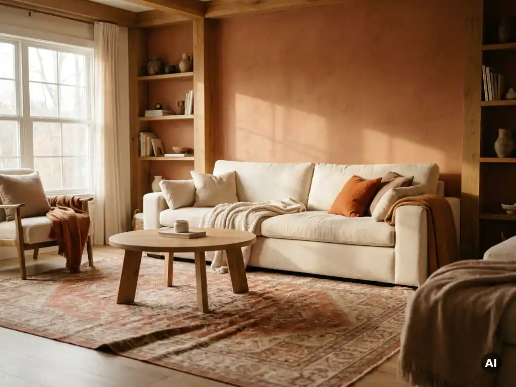
Knowing how to place furniture in a living room, or any room, is harder than it looks, and the most common furniture layout mistakes are easy to make without realising it. Should furniture be against the wall? How far should the coffee table sit from the sofa? What happens to traffic flow when a sectional is too large for the space? The answers to these questions determine whether a room feels open and welcoming or cramped and cold. The most frequent offenders are pushing every piece flat against the walls, choosing the wrong scale for the space, blocking natural pathways, and arranging seating that prioritises the TV over conversation. The sections below break down each mistake and explain exactly how to fix it.
Why does furniture placement make rooms feel smaller?
Furniture placement makes rooms feel smaller when pieces are pushed flat against the walls, leaving a dead, empty centre and creating a visual box around the perimeter. Floating furniture away from walls and grouping it inward — counterintuitive as it seems — makes a room feel larger and more purposeful. Scale, proportion, and the amount of floor visible between pieces all influence how spacious a space reads.
When every sofa, cabinet, and chair is lined up against a wall, the eye travels around the edges of the room rather than through it. That perimeter arrangement emphasises the room’s boundaries instead of its depth. Floating a sofa even 30 to 40 centimetres from the wall, with a console table behind it, immediately creates layers that add perceived depth.
Oversized rugs that stop short of the furniture legs are another common culprit. A rug that is too small visually chops the room into disconnected islands. Anchoring all key furniture legs on a single rug pulls the arrangement together and signals to the eye that the space is cohesive and generous.
What are the most common furniture layout mistakes in living rooms?
The most common living room layout mistakes are: furniture pushed against every wall, a sofa that is too large or too small for the space, a coffee table placed too far from the seating, poor rug sizing, and seating arrangements that prioritise the TV over human conversation. Each of these mistakes disrupts either the visual balance or the practical usability of the room.
Here is a quick overview of the most frequent offenders:
- All furniture against the walls: creates a disconnected, waiting-room feel with an awkward empty centre
- Wrong sofa scale: an oversized sofa dominates and blocks flow; an undersized one looks lost and makes the room feel sparse. The choice of furniture upholstery fabric also affects perceived scale: heavy, dark textiles make a piece read as larger and heavier, while lighter fabrics and open weaves keep the visual weight lower.
- Coffee table too far away: the general rule is 35 to 45 centimetres between the sofa and coffee table; anything beyond that makes it impractical to use
- Undersized rug: a rug that does not anchor the full seating group fragments the arrangement visually. A flatweave rug can work well in high-traffic areas, but the sizing rule still applies: front legs of all key seating pieces should rest on it.
- Blocking windows or doorways: cutting off natural light or pinching entry points makes even a well-furnished room feel cramped
- Too many pieces: filling every corner with furniture removes breathing room and makes the space feel cluttered rather than complete
- Accent chairs placed without purpose: a slipper chair or accent chair added to fill a corner without considering sightlines and clearance becomes an obstacle rather than an asset. Position accent seating so it contributes to the conversational grouping and leaves at least 60 centimetres of clearance around it.
How do you know if your furniture is the wrong scale for a room?
Furniture is the wrong size for a room when it leaves less than 60 to 90 centimetres of clearance for walking paths, when it visually dominates or disappears within the space, or when it makes the room feel impossible to move through comfortably. Scale problems are among the most impactful furniture spacing mistakes because they affect both function and aesthetics simultaneously.
A practical way to check scale before buying is to tape out the footprint of a piece on the floor using masking tape. If the taped outline leaves you with narrow corridors or crowds the remaining furniture, the piece is too large. If it looks lost in the space, it is too small.
Proportional mismatches between individual pieces also matter. A low, sprawling sectional paired with a tall, narrow bookcase creates visual tension because the two pieces occupy completely different visual weight categories. Aim for a mix of heights and depths that feel graduated rather than randomly assembled.
As a quick reference, here are the minimum measurements that define a well-scaled, comfortable furniture layout:
| Layout element | Recommended measurement |
|---|---|
| Sofa to coffee table gap | 35-45 cm |
| Main traffic corridor width | minimum 90 cm |
| Secondary walkway width | minimum 60 cm |
| Sofa float from wall | 30-40 cm |
| Minimum living room rug size | 200×290 cm |
| Bedroom side clearance per occupant | 60-70 cm |
| Dining chair push-back clearance | minimum 90 cm |
If your current layout falls short on any of these, that is your clearest signal that a rearrangement, or a different piece entirely, is needed.
Should all furniture face the TV or the centre of the room?
Not all furniture should face the TV. The strongest living room layouts are built around a conversational grouping first, with the TV positioned as a secondary focal point that can be viewed comfortably from most seats without requiring every piece to face it directly. Designing entirely around the TV produces seating that feels like a cinema row rather than a living space.
A well-balanced arrangement typically places the main sofa facing the primary focal point — whether that is a fireplace, a window, or the TV — with accent chairs angled at roughly 45 degrees. This allows the seating group to function as a conversation area while still giving most occupants a comfortable sightline to the screen.
If the TV is mounted on a wall that creates an awkward layout, a swivel TV stand or an angled media unit can resolve the conflict without forcing the entire room to orient around it. The goal is flexibility, not a single rigid axis.
How do you arrange a U-shaped living room layout with a TV?
A U-shaped living room layout uses a main sofa and two flanking sofas or chairs facing inward to form three sides of a square, with the open fourth side typically facing the TV or fireplace. It is one of the most sociable seating configurations available, but it comes with specific challenges that are easy to overlook when planning from a flat floor plan alone.
For TV placement in a U-shaped living room layout, the screen should be centred on the wall facing the open side of the U, mounted so that the centre of the screen sits at approximately 100 to 110 centimetres from the floor, which corresponds to seated eye level. Within the arrangement itself, leave at least 45 centimetres between the coffee table and each seating piece for comfortable legroom, and maintain a minimum of 90 centimetres of clearance on the open side of the U to allow easy traffic flow in and out of the seating group.
In larger rooms, a U-shaped arrangement risks feeling disconnected if the individual pieces are spread too far apart. Keeping the total width of the U under 3.5 metres maintains a conversational scale where occupants can speak and hear each other comfortably without raising their voices. If the room is generous enough that the U would exceed that width, consider anchoring the arrangement with a larger central coffee table or a generous rug to visually hold the pieces together.
What causes awkward traffic flow in a furnished room?
Awkward traffic flow in a furnished room is caused by furniture that blocks natural pathways between doorways, by pieces placed too close together to walk between comfortably, and by layouts that force people to navigate around the seating group rather than through the room in a direct line. Interior design professionals generally recommend a minimum of 90 centimetres for main traffic corridors and at least 60 centimetres for secondary paths.
The most common trigger is a sofa or sectional placed perpendicular to the main entry point, creating an immediate obstacle the moment someone enters the room. Repositioning the sofa parallel to the entry wall, or leaving a clear path along one side, restores flow without requiring a complete redesign.
Furniture that juts into doorways or sits directly in front of windows also disrupts movement. Even if the piece fits spatially, it creates a psychological pinch point that makes the room feel harder to navigate. Mapping the natural desire lines through a room — the paths people instinctively want to take between entry points — is the most reliable way to identify and eliminate these bottlenecks before they become permanent problems.
What are the most common furniture layout mistakes in a dining room?
Dining rooms are where scale errors are most immediately felt. The most frequent mistake is choosing a dining table that is too large for the room, leaving less than 90 centimetres of clearance behind the chairs. That gap matters because occupants need enough space to push their chair back and stand up comfortably without hitting a wall or sideboard. The recommended minimum is 90 to 100 centimetres between the table edge and the nearest wall or piece of furniture, measured from the chair in its occupied position.
Two other common errors compound the problem. Placing the dining table off-centre relative to the overhead light fixture creates an unbalanced look and uneven task lighting, making the table feel like an afterthought rather than the room’s centrepiece. Using dining chairs that are too bulky for the table scale has a similar effect: the arrangement feels heavy, the usable floor area shrinks, and the room loses the sense of ease that a well-proportioned dining space should have. A 3D room planner lets you test table and chair combinations to scale before buying, so these proportion problems are caught before delivery day rather than after.
How do you place a console table in a hallway without blocking the space?
Console table hallway placement is where two mistakes appear most consistently. The first is choosing a console table that is too deep for the corridor. In a hallway where people need to pass comfortably, the recommended maximum depth for a console table is 30 to 35 centimetres. Anything deeper begins to narrow the usable walking width and creates a pinch point that makes the entry feel cramped rather than welcoming. The second common error is placing the console table directly opposite the front door, which visually closes off the entry and gives the impression of a blocked, unwelcoming space the moment someone steps inside.
The correct approach to hallway furniture placement is to position the console table along the longest uninterrupted wall, leaving at least 90 centimetres of clear walking width beside it. Keep the surface height between 75 and 90 centimetres, which aligns with standard door handle height and creates a proportional, intentional look. At that height and depth, the console table reads as part of the architecture rather than an obstacle placed in the way of movement.
How can 3D room planning tools help avoid furniture layout mistakes?
3D room planning tools help avoid furniture layout mistakes by letting you visualise exactly how furniture fits, flows, and looks together in a space before anything is purchased or moved. Instead of relying on guesswork or flat floor plan sketches, you can experiment with scale, arrangement, and style in real time, catching spacing problems, traffic flow issues, and proportion mismatches before they become costly errors.
Traditional furniture shopping forces buyers to imagine how a piece will look in their home based on a product photo taken in a showroom. That gap between imagination and reality is where most layout mistakes originate. When thinking about how to place furniture in a living room, the challenges multiply quickly: fixed elements like radiators, plug sockets, and window sill heights rarely appear in product listings, yet they directly affect the placement of furniture in a living room. Three of the most costly online-buying errors follow from ignoring this reality. First, buyers often fail to check whether a sofa or bed frame will fit through the front door and up the staircase before purchasing, since delivery access is as important as room fit. Second, those fixed room elements — radiators, plug sockets, window sill heights — are routinely overlooked when reading product dimensions online. Third, ordering multiple pieces separately without checking how their combined footprint affects traffic flow is a frequent source of expensive returns. A 3D room planner closes that gap by placing true-to-scale 3D models of actual products into a digital version of the customer’s room, making the consequences of each layout decision immediately visible.
The practical benefits extend well beyond aesthetics. Seeing traffic paths, door clearances, and furniture groupings in three dimensions makes it far easier to spot the common furniture arrangement mistakes described throughout this article, before a sofa is delivered and a return has to be arranged.
How iONE360 helps you avoid furniture layout mistakes
iONE360 is a visual configuration software specialist for the furniture and interior market. We built our room planning software specifically to eliminate the uncertainty that leads to layout mistakes, returns, and buyer regret. iONE360’s 3D room planner gives customers and retailers a powerful, web-based environment where every decision can be tested visually before it is committed to, making it one of the most cost-effective and scalable solutions available for furniture brands and retailers.
Here is what makes our solution stand out for furniture brands and retailers:
- True-to-scale 3D visualisation: customers place exact product models into their room dimensions, so scale and proportion problems are visible immediately
- Real-time product configuration: sofas, modular units, and other configurable pieces can be customised on the spot, with prices and lead times updating automatically
- Full room decoration: add flooring, wallpaper, curtains, and accessories to see how the complete interior works together, not just individual pieces
- Zoom, rotate, and explore: customers can view their planned layout from any angle, catching awkward placements or traffic flow issues before purchase
- Seamless integration: our room planner connects directly with your existing webshop, PIM, and ERP systems, making it a natural part of the buying journey rather than a separate tool
- HomeDecoHub marketplace option: brands can onboard quickly through our ready-to-use room planning marketplace, powered by the same proven configurator technology
The result is a buying experience that builds confidence at every step. When customers can place a true-to-scale 3D model of a sofa into their own room before checkout, the gap between expectation and reality closes. That means fewer surprises on delivery day, fewer return requests for retailers, and higher average order values as customers feel secure enough to add complementary pieces to their basket. For furniture brands looking to reduce return rates and increase basket size, our room planner is the most direct tool available. We would be glad to share how retailers using iONE360 have seen measurable improvements across these metrics.
Ready to help your customers plan their rooms with confidence? Get in touch with us and find out how iONE360’s room planning software can transform your sales process.
Frequently Asked Questions
How do I start rearranging my living room if I'm not sure where to begin?
Start by clearing the room completely, or at least mentally resetting it, and identifying the room’s natural focal point, whether that is a fireplace, a large window, or the TV wall. Build your layout outward from that focal point, placing your largest seating piece first and then arranging secondary pieces around it. Use masking tape on the floor to map out furniture footprints before moving anything heavy, and always check that you have at least 90 centimetres of clearance on main walkways before committing to a final arrangement.
What is the right rug size for a living room seating arrangement?
The most reliable rule is to choose a rug large enough for at least the front legs of every key seating piece to rest on it, though having all four legs on the rug is ideal for larger spaces. A rug that is too small floats beneath only the coffee table and visually disconnects the seating group, making the room feel fragmented. In practical terms, a 200 x 290 cm rug is often the minimum for a standard living room, and sizing up is almost always the safer choice.
Can these layout principles work in very small rooms, or do the rules change?
The core principles apply in small rooms too, but some adjustments help. Floating furniture slightly away from walls still works, even in compact spaces, because it creates the illusion of depth rather than boxing the room in. Prioritise multi-functional pieces, limit the total number of items, and favour furniture with exposed legs, which allows light to pass underneath and makes the floor area feel more generous. Avoiding oversized rugs and choosing a single, well-scaled focal arrangement rather than multiple competing groupings is especially important when square footage is limited.
What is the biggest mistake people make when buying furniture online without planning the layout first?
The most costly mistake is relying on a product’s listed dimensions without translating those numbers into the actual context of the room. A sofa that is 280 cm wide sounds manageable in isolation, but placed in a room with doorways, a TV unit, and an existing armchair, it can completely block traffic flow or overwhelm the space. Visualising the piece to scale within your specific room, ideally using a 3D room planner before purchasing, is the single most effective way to avoid an expensive return.
How do I arrange furniture in an open-plan living and dining space without the two areas feeling chaotic?
The key to open-plan layouts is using furniture and rugs to create clearly defined zones rather than letting pieces bleed into one another. Place a rug under the dining table and a separate rug anchoring the seating group to visually separate the two areas, and orient the sofa so its back subtly divides the zones without blocking sightlines. Keeping a consistent colour palette and material language across both areas ties the overall space together so the zones feel intentional rather than disjointed.
How often should I reconsider my furniture layout, and what are the signs it is no longer working?
A layout that once worked can stop functioning well as your household’s needs change, whether that means a new family member, a shift to working from home, or simply new furniture additions that alter the balance. Clear signs it is time to reassess include regularly navigating awkwardly around pieces, feeling like the room is cluttered even after tidying, or noticing that certain seating is rarely used because it is poorly positioned. Revisiting your layout seasonally, or whenever a major new piece enters the room, is a practical habit that keeps the space feeling intentional.
Are there any common mistakes specific to bedroom furniture layouts?
The most frequent bedroom layout mistake is placing the bed against the wall on one side to save space, which makes it inconvenient for one occupant and disrupts the visual symmetry that makes bedrooms feel restful. Ideally, the bed should be centred on the main wall with equal clearance on both sides, with at least 60 to 70 centimetres of walking space. Oversized wardrobes placed directly opposite a small bed are another common issue, as the visual weight imbalance makes the room feel oppressive rather than calm.
Should furniture be against the wall?
In most rooms, pushing all furniture flat against the walls is one of the most common layout mistakes you can make. It creates an empty, disconnected centre and makes the room feel like a waiting area rather than a lived-in space. Floating your main sofa 30-40 centimetres from the wall, with a console table behind it, creates visual depth and makes the room feel larger, not smaller. The exception is in very narrow rooms where clearance is genuinely limited, but even then, at least the primary seating piece benefits from being pulled slightly inward.
What is the best furniture layout for a small living room?
The best layout for a small living room centres one clearly defined seating group around a single focal point, whether that is the TV, a fireplace, or a window, and avoids filling every corner with additional pieces. Choose furniture with exposed legs to keep the floor visible and the space feeling open, use a single well-sized rug to anchor the group rather than multiple small rugs, and resist the urge to push everything against the walls. A compact L-shaped or two-sofa arrangement often works better than a full U-shape in smaller rooms, where the U can feel enclosing rather than welcoming.
Related Articles
- How does a product configurator handle complex product variants?
- How AI product configurators are transforming furniture sales in 2027-2030
- How to place 3D furniture models into real room photos with AI with iONE360 product configuration software
- How do 3D product configurators support B2B and B2C sales at the same time?
- How does a 3D product configurator differ from a standard one?