

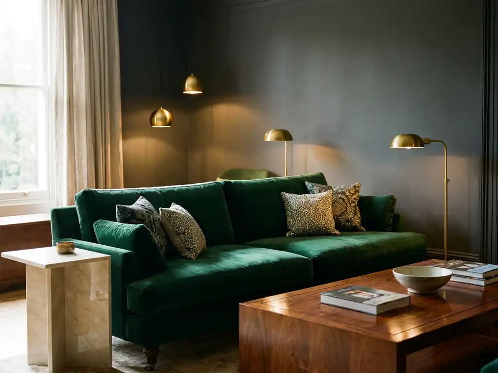
Colors that make a room look expensive include rich neutrals like charcoal gray, warm beige, and cream, deep jewel tones such as emerald green and sapphire blue, and classic combinations like navy with gold accents. These sophisticated palettes create depth, elegance, and timeless appeal that elevate any space.
What colors make a room look expensive and luxurious?
Rich neutrals, deep jewel tones, and monochromatic schemes make rooms look expensive. Colors like charcoal gray, navy blue, forest green, warm cream, and sophisticated blacks create depth and elegance that elevate any space beyond typical decorating approaches.
The most luxurious color palettes share common characteristics: they use complex, nuanced shades rather than primary colors, incorporate multiple tones within the same color family, and maintain sophisticated restraint. Rich neutrals like mushroom gray, warm taupe, and cream provide an elegant foundation that feels both timeless and current.
Deep jewel tones add instant luxury when used strategically. Emerald green, sapphire blue, and deep burgundy create dramatic focal points that feel intentional and curated. These colors work particularly well as accent walls or in upholstery, where they can make a statement without overwhelming the space.
Why do neutral colors make rooms look more expensive?
Neutral colors create visual cohesion and timeless elegance that expensive design relies on. They provide a sophisticated backdrop that highlights quality furnishings and architectural details, while avoiding the dated appearance that bold colors can create over time.
The psychology behind neutral sophistication lies in their complexity. Expensive-looking neutrals are never flat or one-dimensional. Instead, they contain subtle undertones that shift throughout the day as lighting changes. A sophisticated gray might have blue or green undertones, while an elegant beige contains hints of pink or yellow that add warmth and depth.
Neutral palettes also allow expensive materials and textures to take center stage. When walls are painted in refined neutrals, attention naturally flows to quality furniture, artwork, and architectural features. This creates the layered, curated look that defines luxury interiors.
Which paint finishes make colors look more premium?
Matte and eggshell finishes make colors look most premium by creating depth and sophistication. These finishes hide imperfections while providing rich color saturation that feels expensive, unlike glossy finishes that can appear cheap and highlight wall flaws.
Matte finishes offer the most luxurious appearance because they absorb light rather than reflecting it, creating rich, velvety color depth. This finish works particularly well with deep colors like navy or charcoal, where the matte surface enhances the color’s intensity and creates a sophisticated, expensive feel.
Eggshell provides a subtle compromise, offering a slight sheen that’s easier to clean than matte while maintaining a sophisticated appearance. This finish works well in high-traffic areas where you want a luxurious appearance with practical maintenance. Avoid semi-gloss and high-gloss finishes in main living areas, as they can make even expensive paint colors look cheap and institutional.
How do you create expensive-looking color schemes on a budget?
Create expensive-looking schemes by using the 60-30-10 rule with sophisticated colors, investing in quality paint for main walls, and adding luxury through carefully chosen accent pieces rather than expensive furniture. Focus your budget on paint quality and strategic color placement.
Start with one sophisticated neutral as your dominant color covering 60% of the space. Choose complex neutrals like greige, warm white with undertones, or soft charcoal rather than basic beige or stark white. Quality paint makes a significant difference in how colors appear, so invest in premium brands for main wall colors even if you economize elsewhere.
Use the 30% secondary color for larger accent pieces like curtains, area rugs, or an accent wall. The 10% accent color appears in smaller accessories like pillows, artwork, or decorative objects. This approach creates the layered, intentional look of expensive design while keeping costs manageable by focusing spending on paint and a few key pieces rather than replacing all furniture.
Strategic use of room planning software can help you visualize these color combinations before committing to purchases, allowing you to experiment with expensive-looking palettes virtually and avoid costly mistakes.
What color mistakes make rooms look cheap?
Common mistakes include using too many bold colors, choosing flat primary colors instead of complex tones, painting everything the same neutral, and ignoring undertones that clash. These errors create chaotic or bland spaces that lack the sophistication of expensive design.
The biggest mistake is treating color as an afterthought rather than a foundational design element. Rooms look cheap when colors fight each other because undertones clash, when there’s no clear color hierarchy, or when every wall is painted a different bold color without consideration for flow and cohesion.
Another common error is choosing colors based on small paint samples without considering how they’ll look in your specific lighting conditions. Colors that seem perfect in the store can look completely different in your home’s natural and artificial light. Always test colors in large swatches on your walls and observe them throughout the day before making final decisions.
Avoiding these mistakes requires understanding color relationships and planning your palette as a complete system rather than choosing colors room by room. Consider how colors will flow from space to space, ensuring your home feels cohesive and intentionally designed rather than randomly decorated.
How iONE360 helps with expensive-looking interior design
We provide advanced room planning software that helps you visualize sophisticated color schemes before implementation, preventing costly mistakes and ensuring professional results. Our 3D room planner allows you to:
- Test expensive-looking color combinations virtually before painting
- Visualize how different paint finishes affect room atmosphere
- Experiment with furniture arrangements that complement your color palette
- See how lighting affects color choices throughout the day
- Create cohesive color flows between connected spaces
This technology eliminates the guesswork from creating luxury interiors, helping you achieve expensive-looking results while staying within budget. Ready to transform your space with sophisticated color choices? Explore our showcases or contact us to see how our room planning technology can bring your expensive-looking design vision to life.
Frequently Asked Questions
How do I test expensive-looking paint colors without committing to full walls?
Paint large poster boards or foam core sheets (at least 2×3 feet) with your chosen colors and move them around the room at different times of day. This method is much more accurate than small paint samples and lets you see how the colors interact with your lighting, furniture, and existing decor before making the investment in full-wall painting.
What's the biggest mistake people make when trying to copy expensive color schemes they see online?
The most common error is not accounting for their room’s specific lighting conditions and existing elements. A sophisticated navy that looks stunning in a bright, south-facing room with white trim might appear muddy and dark in a north-facing space with wood accents. Always adapt color choices to your unique environment rather than copying schemes exactly.
Can I make a small room look expensive with dark colors, or should I stick to light neutrals?
Dark colors can absolutely make small rooms look expensive and luxurious when used correctly. The key is choosing complex dark colors with rich undertones (like charcoal with blue hints) and ensuring adequate lighting. Dark walls can actually make a small room feel more intimate and sophisticated rather than cramped, especially when paired with lighter furniture and metallic accents.
How do I choose accent colors that complement my expensive-looking neutral base without clashing?
Start by identifying the undertones in your neutral base color, then choose accents that share those same undertones. For example, if your greige has warm undertones, select accent colors with warm bases like terracotta or golden yellow rather than cool blues or purples. Use the color wheel to find analogous colors (next to each other) for harmony or complementary colors (opposite) for controlled contrast.
What's the most cost-effective way to transition from my current bright, trendy colors to a more expensive-looking palette?
Start with the largest visual impact areas first: paint your main living spaces in sophisticated neutrals, then gradually replace bright accessories with ones in your new palette. You don’t need to change everything at once. Focus your budget on quality paint for walls and a few key pieces like curtains or a large area rug that can anchor the new color scheme while you transition other elements over time.
How do I know if my lighting is affecting my expensive color choices negatively?
Observe your painted samples or walls at three different times: morning natural light, afternoon natural light, and evening artificial light. If your sophisticated color looks muddy, flat, or completely different than intended in any of these conditions, you may need to adjust your choice or improve your lighting. Cool LED bulbs can make warm colors look gray, while warm bulbs can make cool colors appear muddy.
Should I use the same expensive-looking color palette throughout my entire home, or can I vary it by room?
Create a cohesive flow by using variations of the same sophisticated palette rather than completely different schemes in each room. Use your main neutral in common areas, then introduce deeper or lighter versions of the same color family in bedrooms and private spaces. This approach maintains the expensive, curated look while allowing for personality and function-specific adaptations in different rooms.
Related Articles
- Which AI tool is best for interior design?
- Do customers actually use room visualizers when shopping?
- How much does room visualizer software cost for businesses?
- What is the difference between a 3D product configurator and a standard product page?
- What return on investment can I expect from a 3D product configurator?